File:Global temperature change - from 1850-2019.jpg
Global_temperature_change_-_from_1850-2019.jpg (800 × 450 pixels, file size: 54 KB, MIME type: image/jpeg)
<addthis />
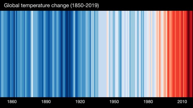
The Stripes Tell a Story
These bands of colors represent the annual temperature anomalies (the difference from the long-term average). Red is above average and blue is below average which is based on a 100 year average.
The Weather Channel
Today, June 18, 2020, you'll see meteorologists around the world sporting these stripes to call attention to our warming planet. They're a visual representation of the global average temperature each year from 1850 to 2019. #ShowYourStripes and learn more:

File history
Click on a date/time to view the file as it appeared at that time.
| Date/Time | Thumbnail | Dimensions | User | Comment | |
|---|---|---|---|---|---|
| current | 17:04, 18 June 2020 | | 800 × 450 (54 KB) | Siterunner (talk | contribs) |
You cannot overwrite this file.
File usage
The following 4 pages use this file: